


Gamification 2.0. Beyond Points and Badges: Designing for Players, Not Metrics. Chapter 3: The Framework
Behavioral Design, Game Design, Gamification Series, Player Engagement, Product Design, UX Design
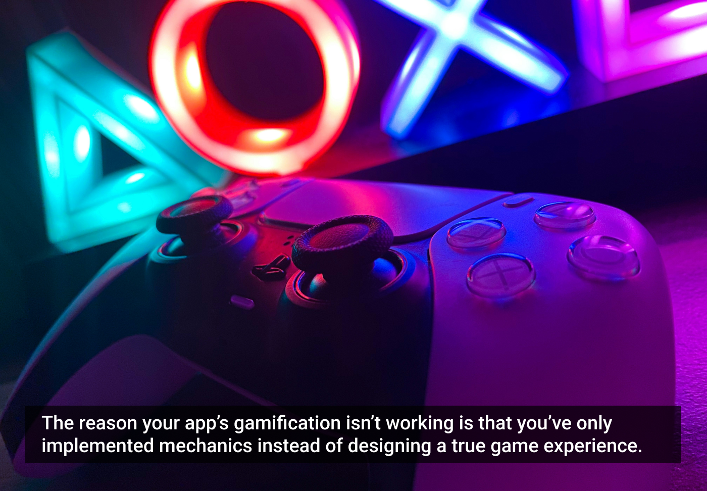
Find out why slapping gamification on your product without first selecting a genre is the silent killer of your engagement strategy.