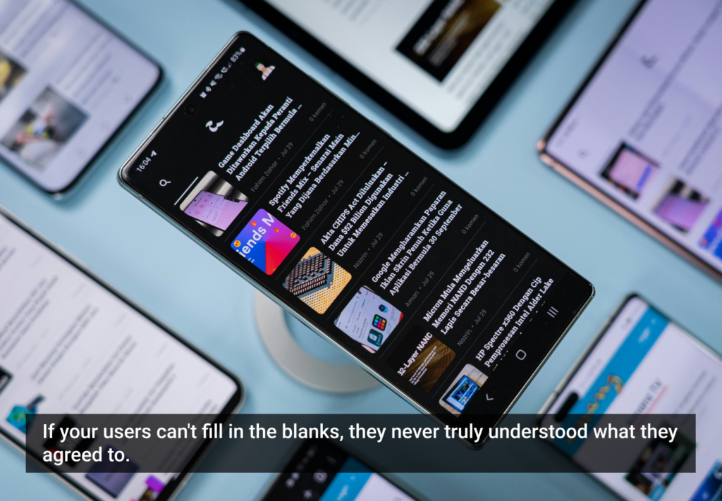
iPad User Experience Guidelines
Apple's Human Interface Guidelines for the iPad outline how to create user interfaces optimized for the iPad device. According to Apple, the best iPad applications: downplay application UI so that the focus is on content; present content in beautiful, often realistic ways; and take full advantage of device capabilities to enable enhanced interaction.
The overview of iPad user experience guidelines listed below is © 2010 Apple Inc. More details on these guidelines and further information on developing for the iPad can be found in Apple's Human Interface Guidelines for the iPad.
Support All Orientations
Your application should encourage people to interact with iPad from any side by providing a great experience in all orientations. The reason is that people don’t view the device as having a default orientation, because they don’t pay much attention to the minimal device frame and they’re unconcerned with the location of the Home button.
Enhance Interactivity (Don’t Just Add Features)
The best iPad applications give people innovative ways to interact with content while they perform a clearly defined, finite task. Resist the temptation to fill the large screen with features that are not directly related to the main task. In particular, you should not view the large iPad screen as an invitation to bring back all the functionality you pruned from your iPhone application.
Flatten Your Information Hierarchy
Although you don’t want to pack too much information into one screen, you also want to prevent people from feeling that they must visit many different screens to find what they want. In general, focus the main screen on the primary content and provide additional information or tools in an auxiliary view, such as a popover.
Reduce Full-Screen Transitions
Instead of swapping in a whole new screen when some embedded information changes, update only the areas of the user interface that need it. When you perform fewer full-screen transitions, your application has greater visual stability, which helps people keep track of where they are in their task.
Enable Collaboration and Connectedness
Think of ways people might want to use your application with others. Expand your thinking to include both the physical sharing of a single device and the virtual sharing of data.
Add Physicality and Heightened Realism
Whenever possible, add a realistic, physical dimension to your application. The more true to life your application looks and behaves, the easier it is for people to understand how it works and the more they enjoy using it.
Delight People with Stunning Graphics
The high-resolution iPad screen supports rich, beautiful, engaging graphics that draw people into an application and make the simplest task rewarding.
De-emphasize User Interface Controls
Help people focus on the content by designing your application UI as a subtle frame for the information they’re interested in. Downplay application controls by minimizing their number and prominence. Consider creating custom controls that subtly integrate with your application’s graphical style. In this way, controls are discoverable, but not too conspicuous.
Minimize Modality
iPad applications should allow people to interact with them in nonlinear ways. Modality prevents this freedom by interrupting people’s workflow and forcing them to choose a particular path.
Rethink Your Lists
Consider a more real-world vision of your application. For example, on iPhone, Contacts is a streamlined list, but on iPad, Contacts is an address book with a beautifully tangible look and feel.
Consider Multifinger Gestures
The large iPad screen provides great scope for multifinger gestures, including gestures made by more than one person.
Consider Popovers for Some Modal Tasks
If you use modal views to enable self-contained tasks in your iPhone application, you might be able to use popovers instead.
Restrict Complexity in Modal Tasks
People appreciate being able to accomplish a self-contained subtask in a modal view, because the context shift is clear and temporary. But if the subtask is too complex, people can lose sight of the main task they suspended when they entered the modal view.
Downplay File-Handling Operations
Although iPad applications can allow people to create and manipulate files and share them with a computer (when the device is docked), this does not mean that people should have a sense of the file system on iPad.
Ask People to Save Only When Necessary
People should have confidence that their work is always preserved unless they explicitly cancel or delete it. If your application helps people create and edit documents, make sure they do not have to take an explicit save action.
Start Instantly
iPad applications should start as quickly as possible so that people can begin using them without delay.
Always Be Prepared to Stop
Like iPhone applications, iPad applications stop when people press the Home button to open another application.
More details on these guidelines and further information on developing for the iPad can be found in Apple's Human Interface Guidelines for the iPad.
Related Articles
- Information Resolution on the Windows Phone Series 7
- Apple's Proposed Multi-Touch UI System
- Microsoft reboots the experience with new Windows Phone OS
- Toward a better tablet OS, part 2
- Apple Event Coverage
- Realism in UI Design
- Adobe and Condé Naste demo WIRED on Adobe AIR
- Toward a better tablet OS, part 1
- Choosing an Approach to Mobile Development
- Tablet usability: the future can't come soon enough
Comments
Absolutely amazing article. This is the kind of work that I love.
Thanks again for the great read and we'll keep in mind when developing.
This is SO incredible — if developers follow these guidelines, we will have many awesome applications. Can't wait to see and buy and use them.
"Delight People with Stunning Graphics"
Really can't with a 4:3 1024x768 display.
Why not?
People have been delighted on the iPhone's 480x320 screen through various app experiences. Are you implying that a bigger canvas is an inhibitor or a catalyst for creativity?
** Editor's note:
Thank you to everyone who has expressed concern about this content potentially being subject to an NDA. UX Magazine is not party to any confidentiality or non-disclosure agreements with Apple, and this content reached us via a public domain source.
That said, we are attempting to make sure Apple will have no objection to this content being posted here. We believe their interface guidelines for the iPad highlight Apple's dedication to solid design strategy and good UX, and that this publication will help attract interest in their new device.
Where is the data to back the claims in this approach to interfaces?
Apple calls for realistic UI elements, and provides the address book as an example. This might look familiar to older people but I can't even remember if I ever had a physical address book!
Likewise, the hyper realistic book handling: flipping pages in a physical book is just a necessity, not an enhancement to the reading experience.
Shouldn't tools delight users by performing efficiently, without unnecessary animations and gestures? Is this "rewarding" of users serving them or the app vendor by increasing unnecessary engagement?
Some skepticism is in order. Even Apple didn't do things this way prior to OS X.
"flipping pages in a physical book is just a necessity, not an enhancement to the reading experience. "
Yeah, I've used a couple of ebook applications on the iPhone and I wish the developers had spent time on something more useful than a really great page tuning animation.
I want one that lets me scroll like Safari. Why do we even need the concept of "pages" in an ebook? Let's use the best UI elements for this new device, not make user experience sacrifices to make it act like something it's not.
Sivan, you raise some good questions, but I think underlying them is a difference in user interface philosophy. Your words say you prefer an interface that just gets things done ("performing efficiently, without unnecessary animations and gestures") while Apple's approach is to get the user involved with the experience ("…encourage people to interact with the iPad from any side…" "…give people innovative ways to interact with content…" "Add Physicality…" "…including gestures made by more than one person"). I'm not sure skepticism is required as much considering something different.
As for Apple not doing things this way prior to OS X, Apple has been very consistent with this interface approach since well before OS X. Here are two paragraphs from the 1995 Macintosh Human Interface Guidelines (Chapter 1, Human Interface Principles), some six years before OS X was introduced with version 10.1 in March, 2001:
Metaphors
You can take advantage of people’s knowledge of the world around them by using metaphors to convey concepts and features of your application. Use metaphors involving concrete, familiar ideas and make the metaphors plain, so that users have a set of expectations to apply to computer environments. For example, people often use file folders to store paper documents in their offices. Therefore, it makes sense to people to store computer documents in computer-generated folders that look like file folders. People can organize their hard disks in a way that’s analogous to the way they organize their file cabinets.
Direct Manipulation
Direct manipulation allows people to feel that they are directly controlling the objects represented by the computer. According to the principle of direct manipulation, an object on the screen remains visible while a user performs physical actions on the object. When the user performs operations on the object, the impact of those operations on the object is immediately visible. For example, a user can move a file by dragging an icon that represents it from one location to another or can position a cursor in a text field by directly clicking the location where the cursor should be placed.
Re: Sivan, "Likewise, the hyper realistic book handling: flipping pages in a physical book is just a necessity, not an enhancement to the reading experience. Shouldn't tools delight users by performing efficiently, without unnecessary animations and gestures? Is this "rewarding" of users serving them or the app vendor by increasing unnecessary engagement?"
I, for one, think the iBooks App on the iPad looks amazing! But I understand what you are saying about efficient performance over visual wows, however what you failed to realize is that someone at Apple must have had the exact same opinion because the iBooks App actually functions BOTH ways. If you simply tap on the sides of the screen the pages change forward and back (depending on which side you tap) without any unnecessary animations just like turning pages on a Kindle! It's only when you hold and swipe that the pages animate, so the functionality is totally at the discretion of the end user. So you really need to thoroughly research your arguments before you go demonizing their new UI, especially when the device hasn't even gone to market yet and only a few people have actually held the device. Oh and the fact that you have never owned a physical address book does not change the fact that seeing your contacts in a format similar to a physical book is an infinitely more enjoyable and user friendly experience than a plain old list the way it is currently shown on the iPhone. If they had made contacts on the iPad look like contacts on the iPhone it would have looked horrible.
@Douglas
"As for Apple not doing things this way prior to OS X, Apple has been very consistent with this interface approach since well before OS X. Here are two paragraphs from the 1995 Macintosh Human Interface Guidelines (Chapter 1,
Human Interface Principles), some six years before OS X was introduced with version 10.1 in March, 2001: Metaphors You can take advantage of people’s knowledge of the world around them by using metaphors to convey concepts and features of your application. Use metaphors involving concrete, familiar ideas and make the metaphors plain, so that users have a set of expectations to apply to computer environments. For example, people often use file folders to store paper documents in their offices. Therefore, it makes sense to people to store computer documents in computer-generated folders that look like file folders. People can organize their hard disks in a way that’s analogous to the way they organize their file cabinets."
Where in the original HIG does Apple explain the imperative of "Delight People with Stunning Graphics...that draw people into an application and make the simplest task rewarding"?
"Direct Manipulation Direct manipulation allows people to feel that they are directly controlling the objects represented by the computer. According to the principle of direct manipulation, an object on the screen remains visible while a user performs physical actions on the object. When the user performs operations on the object, the impact of those operations on the object is immediately visible. For example, a user can move a file by dragging an icon that represents it from one location to another or can position a cursor in a text field by directly clicking the location where the cursor should be placed."
Yes, but where is the need for physicality explained in the HIG? Without rehashing historic arguments, OS X clearly broke with Mac OS with photo realism and special effects, and it did it on inadequate hardware for the first part of the decade which made the OS excruciatingly slow. Now Apple is urging designers to unleash special effects on a new class of devices, mobiles, that are underpowered and need to preserve battery.
If Apple did not urge this approach to UI design before, it should't be held as gospel. It came with OS X and it's being perpetuated for reasons that may or may not be appropriate for a new class of devices.
So I'm calling for some skepticism instead of gushing over what seems to be a liberation of artists everywhere to get creative for the sake of their users. Wowing users and engaging them strikes me as self-serving, both for the designers, and also Apple, which benefits indirectly.
>gestures made by more than one person.
I didn't actually think of that, but scope for some fun multiplayer (on the same device) games!
Sivan, in 1995 graphics on a Macintosh was very primitive. You couldn't view anything remotely as detailed as a photograph. It just wasn't possible without spending a LOT of money.
By the time OSX came out, you had a 1024x768 on a Powerbook G3, and you could view a realistic-looking photograph.
The guidelines evolved with the capabilities of the hardware.
@thomas
Again, how much of this is actual innovation that helps users, vs helping Apple sell products?
Stunning the user with amazing graphics? Is this interface design or bling?
No? Not much of a designer, are you? Some iPhone apps are truly lovely. Apps on the iPad can be amazing, but only if created by someone who is smart enough to realize it is not just size that makes an impression.
@Sivan: I'm 40, so I've seen physical address books, but you're right, no one younger than I has ever seen one; unfortunately, there is no more recent physical example to model, or they'd have used it. Many people love the experience of turning pages in a book, and for people like you, there's a single tap. If this isn't your cup of tea, there are hundreds of more efficient slates, convertible tablets, laptops and notebooks you can opt for.
Do you plan on marrying the most delightfully efficient cook/housekeeper without unncessary good looks or voluptuous figure, or the most delightful to look at (and also beautiful on the inside)? No one is "delighted" by efficiency; we are delighted by beauty, even the nerdiest of us.
Approximately 80% of the population thinks like you, function over form. But judging by the phenomenal success of iPods and iPhones over more graphically primitive, more "efficient" alternatives, a significant portion of your sensible peers seems to be delighted by it as well.
David
@david
"Do you plan on marrying the most delightfully efficient cook/housekeeper without unncessary good looks or voluptuous figure, or the most delightful to look at (and also beautiful on the inside)? No one is "delighted" by efficiency; we are delighted by beauty, even the nerdiest of us."
That was a horrible example.
Giant, thin, ipod that doesn't support flash...enjoy.
If you can't save, how do you revert or save copies?
I agree that a lack of flash technology is a failure. However, Apple's sales don't lie. You can argue as long as you wish, but the truth is that the most (if not all) of these guidelines are extremely usefull.
@Sivan
Wait for a year and get yourself an iPad, and then regret that you haven't got it on the very first day.
@Russell
David's example makes sense.
@Milo
Flash's days are gone.
@Adam
The iPad takes care of it.
I agree in part. Simulating the form or interaction of an application's physical counterpart does not necessarily make for a better software experience – Your case of an e-book is a valid one. On the other hand, tapping into a user's existing knowledge of a physical object can make an interface feel familiar and can help to set expectation for what function a UI element may have. The obvious example is a virtual button that looks like a physical button is clearly something that can be pressed/tapped/clicked to initiate a function.
The address book is an interesting one. I have never owned a physical address book either yet when I see the icon I instinctively understand what it is and generally have accurate expectations of what it will do. Although the association with a physical address book may not be what does this so much as the wide use of the metaphor across all sorts of digital devices.
Sorry – comments in my above post are intended in response to @Sivan
@sivan
You are out of mind man. Go enjoy your netbook.
@Randy
"...demonizing their new UI, especially when the device hasn't even gone to market yet and only a few people have actually held the device."
But it's OK to gush over how perfect and amazing it is "when the device hasn't even gone to market yet and only a few people have actually held the device?"
Why is speculative praise OK but skepticism not?
Chess?
Cards?
Dominoes?
This conversation would be funny if it weren't so depressing.
So here we have what is supposedly one of the world's leading technology companies launching what it calls a "magical and revolutionary" product. And what does it do? It goes and encourages developers to build twee simulacra of physical objects. How unmagical. How unrevolutionary. How dull. Apple have seriously employed top-flight designers and developers to build digital representations of address books and books and goodness knows what else that computers are designed to get rid of. And by "get rid of" I mean "eliminate as a concept" not "replace with a digital lookalike". Now they want everyone else to do the same. No thanks. This is 2010 not 1910.
This approach is an enormous dead end that's wrong on so many levels and plays itself out in various ways, some quite obvious, others more subtle and insidious. In a pragmatic sense, it just doesn't work on its own terms. Digital metaphors of physical objects are full of leaky abstractions, being both capable of things that their physical counterparts are not and (surprise!) not capable of things their physical counterparts are. No-one seriously designs these metaphors to be perfect -- it's impossible. With computers being mainstream for at least twenty years I'm wondering why anyone's still bothering at all. The desktop metaphor for graphical user interfaces was a smart-ish idea compared with the alternatives in 1984. With every year that passes it gets shot through with more and more holes. And the iPad is supposedly the device that moves on from all that. It certainly has the potential as a piece of hardware, as an OS, as a platform. So why try to limit designers' approaches to something so decidedly retrospective?
But the real problem is much worse than some of the cheesy UI elements like page curls, as excruciating as they may be. What's wrong with this scenario?
I go to the (virtual) bookshop and browse through the (virtual) books. I find one I like and I pay real money for it. The (virtual) book gets transferred to me and placed on my (virtual) bookshelf alongside the other (virtual) books I've bought and that I now have to store and organise.
Hey! It's just like the real world!
Quite. With most of its limitations, inefficiencies and exclusions comfortingly intact. Business as usual.
Page curl and page turning is a cartoon of something that's an artifact of pagination which is a consequence of the former necessity for long-form texts to be printed and bound and distributed as such in the physical world. So are bookshops. So is the concept of owning a book. So are bookshelves and private collections of books. And yes, I notice that the age-old tradition of handing over real money for the non-exclusive opportunity to access a particular small and pre-defined chunk of content is still going strong.
Designers: You can think of better ways of doing it than this. Numerous better ways. You could get the genius lovechild of Edward Tufte and John Pawson to redesign iBook's UI and it'd still be a bad idea. We don't need iBook any more than we need books. We still need ideas. We still need texts. But where they start and where they end and how we represent them and how we can explore them -- that's all up for grabs. Can we do this on the iPad? Probably. Should we try? Definitely. Does Apple want us to? Frankly, probably not.
Someone mentioned beauty. Supposedly there are 80% of people that like "functional" stuff and 20% that like "beautiful" stuff. That 20% are supposedly Apple's customers. and the rest still use slide rules, telephone directories and Windows Mobile. I'm not going to pick apart how right or wrong that may be right now. But I'll say this:
If beauty is making digital simulacra then we need a new aesthetic. If beauty is perpetuating not just the appearances but the cruel limitations of things past, it's time to move on. We need a digital aesthetic that's more than skin deep. One based on possibilities and power that continue to delight us as we use our new digital tools rather than briefly amusing us when we first encounter them. And yes, given that these are new things they should look like new things too. Get the message? If you're not experiencing Google Search on an aesthetic level you're not paying enough attention. I'm not talking about how it looks. I'm talking about what it can do for you. We need more of that. A whole lot more. In the short term, it's about companies paying their bills, thriving, profiting. In the long run it's about the entire field of computing progressing or stagnating, not the fortunes of any particular company. It's about having an information society rather than an information technology society. You want to have something worthy of an upgrade in 2020? Step away from those horseless carriages. Don't look back.
In short, if you love notebooks, buy a Moleskine. If you want to be a cartoonist, go and work for Pixar. If you're confused about which way time's running, go cyberpunk or trawl eBay for a Newton. And if you want to make a genuinely "magical and revolutionary" break with the past on the iPad platform -- and I think you should -- then forget about physicality and virtuality and retro computing and go and make something that not only doesn't exist in the physical world but doesn't exist in the digital one either. After two decades of mainstream computing we're more than ready for something genuinely digitally native. We can stand the shock of the new. I hope that someone at Apple still understands that sometimes you've just got to break the rules -- including your own.
Speaking of simulacra: http://twelvesouth.com/products/bookbook/
Post new comment