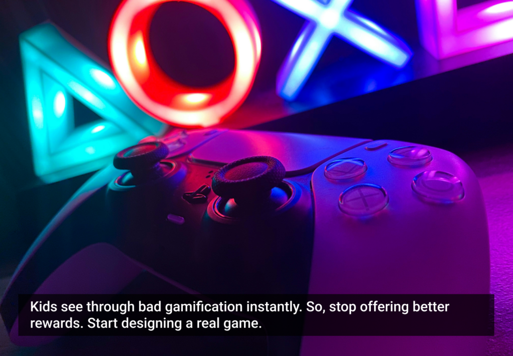
We’re really digging the new BBC beta homepage. Clean, simple and complete. Not sure how useful the clock is though.
Although I like the site overall, I have to say that the contrasts don’t work for me: somehow, I find the visual chunking rather confusing, maybe it is because of all the round stuff in between, I guess I am looking for clear lines and can’t really find them. Also, when items are collapsed, they almost disappear on my low contrast laptop screen.
On the other hand, it is refreshingly different, and I think that’s what I find attractive about the site. It’s not just another web 2.0 portal place that is screaming for attention, it’s almost like an Apple gadget that tries to convince you with its unique style :-)
Too much whitespace for me. But this custom stuff is cool.
While I agree with Emilio that the beta design doesn’t fit the BBC visual communication style, I am completely drawn to the new design. The whitespace and font size are a welcome relief. I love the contrast and overall layout.
It may be more informal, but comparing the current to the beta is interesting. The sharpness of the beta design is quite unique.
The type is way too big. I think it all looks a bit amateur and blog-ish. Much prefer the layout of http://www.rte.ie/news/
We’re really digging the new BBC beta homepage. Clean, simple and complete. Not sure how useful the clock is though.
18 December 2007, 11:32 ( Permalink )
Does the clock need to be useful? Others have singled it out as ‘cute’. Perhaps it just adds a little personality?