Making the Invisible, Visible: 6 Months of Diving Deeper into AI
AI Agents, Artificial Intelligence, Product Design, Psychology and Human Behavior
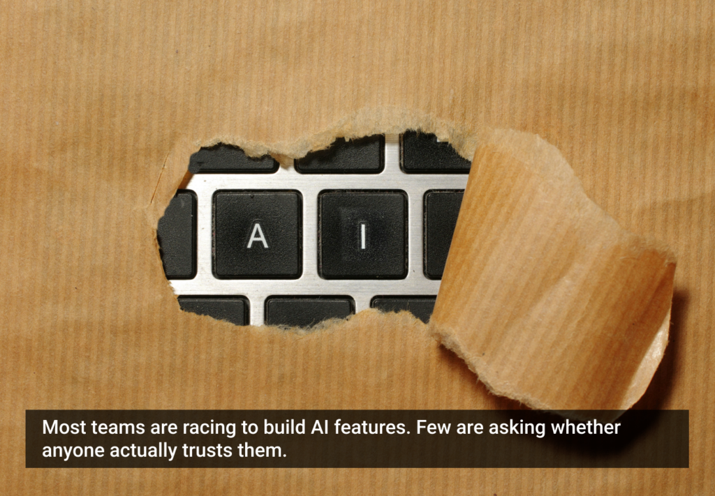
Learn why shipping AI features is the easy part and what it takes to get people to trust them.

We stand with Ukraine and our team members from Ukraine. Here are ways you can help
A community of over 1 million

AI Agents, Artificial Intelligence, Product Design, Psychology and Human Behavior
Learn why shipping AI features is the easy part and what it takes to get people to trust them.
Behavioral Design, Game Design, Gamification Series, Player Engagement, Product Design, User Psychology, UX Design
Find out why slapping badges and points into your app doesn’t work and what six principles from real game design actually drive long-term engagement.

Read more articles
Join the UX Magazine community!
Stay informed with exclusive content on the intersection of UX, AI agents, and agentic automation—essential reading for future-focused professionals.
Hello!
You're officially a member of the UX Magazine Community.
We're excited to have you with us!
Thank you!
To begin viewing member content, please verify your email.
Get Paid to Test AI Products
Earn an average of $100 per test by reviewing AI-first product experiences and sharing your feedback.
